Queens Medical Office
Improving a medical clinic’s web experience to better serve over 50,000 low-income patients.


Themes
Information Architecture
Web Design
Branding
Teams
Founder
Clinic Secretary
Myself
Tools
Sketch
Invision
Illustrator
Wix
Timeline
2 Months
June 2018 -
August 2018
The Client
Queens Medical NYC, a Reputable Clinic in New York
For over 20 years, Queens Medical Office, P.C. has been serving both Queens and the entire New York City area. Located in some of the most culturally diverse neighborhoods in the country, making it very important to offer personalized care. Their experienced providers are very attentive to the individual needs of every patient and are committed to offering the highest quality medical services and healthcare.
Although they provide excellent care they were struggling with their online presence and exposure. Patient retention is very strong but they are lacking growth with new patients.
With my design help, we were able to successfully rebrand and launch a new website that increased their exposure to new patients. Since the redesign, Queens Medical now tends to over 50,000 patients a year.
1000 Patients
Average Per Week
50,000 Patients
Average Per Year
Our Goal
How might we increase new patient visits?
With new locations opening up, Queens Medical was looking to get stronger exposure to help increase traffic to their clinics. We decided to focus our efforts on improving their online exposure with a new website, a fresh redesign to their branding, and by building out an online presence through social media platforms.
This would allow potential new patients to quickly find important information on the clinics such as locations, insurance coverage, services provided, and documents for sign up.
Heuristic Evaluation
Queens Medical's Current Website
When looking into Queens Medical’s current website, it was apparent that it was an afterthought and had little to no functionality that could help their business or their patients. The website was riddled with broken links, poor typography, and outdated information. ce coverage, services provided, and documents for sign up.

Poor color
choices
Broken Links
Repeated info
Outdated plugins
Hierarchy
Information of the old website was poorly laid out with no clear way to find what the user may be looking for.
Broken Links
On the landing page, there were multiple broken links to other pages that were removed or outdated.
Outdated Information
The website did not provide up to date information about the locations, the current staff, or services provided.
No Clear Brand Identity
Queens Medical did not have a logo or even a consistent color scheme on their website.
Research
The Patient Experience
In order to gather key insights, I conducted a series of interviews with the staff and patients. This allowed me to better understand the point of view on both ends of the patient-clinic experience. With this research I was able to identify the patient demographic, major pain points, and the user’s needs for the website. Observing the waiting room was another research method used in order to understand the typical check-in experience.
Based on the research conducted at their locations, I found that patients rarely used the website due to its unfriendly layout or they simply didn't know it existed. The client and I saw an opportunity to improve the patient experience by providing helpful clinic information and increasing online exposure.
A key pain point for new patients typically involved finding important information regarding clinic location, health insurance coverage, and services were provided.
The Patients
The age range of a patient was between 30-60. Most were not even aware the clinic has a website. Many were immigrants or recently moved to Queens.
Exposure
Patients only knew about the business because of word of mouth or they lived close by and saw it. They didn't use an online tool to find it.
Personas + Journey Map
At the time, the clinic was serving patients in 4 locations throughout the borough of Queens. Most of their patients are immigrants between the ages of 30 to 60. These personas reveal that they typically are low income, fairly new to the area, and need to make sure insurance coverage is not an issue.


Design Direction
Designing with Association
When designing the website and branding, the client wanted to make a visual connection to their clinics. Blue is widely seen as a color of trust and nourishment which goes hand in hand with the type of image and services they provide. This resulted in shades of blue and a complimentary color as the primary and secondary color for the website and brand.

Social Media
We created a facebook and instagram page that gives the clinic an additional platform for exposure. These pages are used to make announcements and keep patients updated with any important news. A post typically will include an illustration that stays in line with the same style guide to keep the visual language uniform.


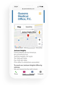
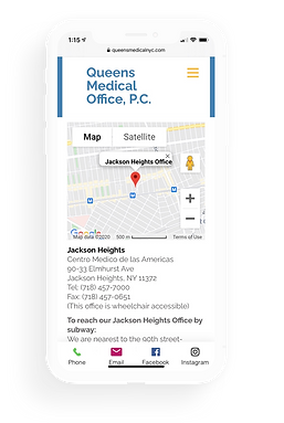
Making It Responsive
Designed for screens of all sizes


Our web analytics revealed that a notable percentage of traffic also came from mobile devices. We therefore ensured that the sizing, images, and icons translated properly between desktop and mobile.
Impact
Results
88%
Average percentage of new visitors to the site per month.
508
Average site visitors per month
300+
Visitors come from a google search ad
per month
We've seen a promising retention rate since launching the new website in 2018. Since its launch, Queens Medical Office has seen a major increase in patient visits. Currently, Queens Medical provides care to around 1000 patients a week. We are constantly monitoring our metrics and adjusting accordingly to fit the business.
We’ve also reached our goal of increasing the amount of younger patients who discovered the clinic via the web and social media. Now, the age range in patients has widened dramatically from young adults to senior citizens.
I can't emphasize how empowering it is to see these positive results. Personal care and health is more important than ever. With a new website and brand direction, Queens Medical has become a prominent clinic in the Burrough of Queens where New Yorkers can seek affordable care.
Coming Soon
Version 2.0
Planned for 2021, the website will receive a revamped design. The updated version will improve on its visual design while adding features meeting the needs of patients due to the Covid-19 pandemic. The updated design will have a cleaner look while allowing patients to efficiently find the information they need. Commonly searched information such as services and insurance coverage will now be accessible directly on the landing page.
Due to the pandemic, Queens Medical has begun providing other options to seek care such as video calls with a medical professional. Currently, patients need to call the clinic to schedule an appointment or virtual visit. With version 2.0, patients will have the ability to schedule an appointment directly on the website.
Landing Page 2.0
The new landing page will have an updated visual design with the addition of the client’s new logo, a new navigation bar and the highly requested feature to book an appointment online. Patients can also book a virtual visit if they do not wish to come in for a visit.
Redesigned navigation bar with updated logo

Updated headliner that provides news and updates
Quick access to booking an appointment or finding information regarding healthcare and specialist
Basic contact information and links to al social media pages
New Feature
Booking an Appointment
Booking an appointment from the landing page is easy and painless. Patients have the option to pick between an in person visit or virtual.

Expanding overlay that quickly allows the user to book an appointment
Patients can pick a location and see the available days and times for that location before booking

View a summary of your selection before confirming.
Simply fill out basic contact information to finalize an appointment.
Locations Page 2.0
The locations page has been redesigned with a new card component which provides brief information to each clinic. Each card links to the selected clinic's new dedicated page that allows the patient to access directions, contact info, updates, and the staff description. Patients can also book an appointment from the dedicated clinic page or learn more about a staff member.

Dedicated pages for each clinic location

Important information on the selected clinic such as contact details and staff
More in depth information regarding directions and contact
Dedicated news feed for announcements and updates at the specific location

Dedicated page for each staff member at the clinics. Users can also book an appointment with the selected staff member.
What's Next
Version 2.0 is a work in progress that is subject to change. Given more time, I would like to run some usability testing on the new features. These tests would allow me to better understand how user friendly these updates are and if they allow the user to reach their goals. On the back end, I would also like to test out different methods of how the clinic would keep track of their scheduling system, by using services such as google calendar invites and google meets invitations for the video calls.
If proven successful, Version 2.0 can launch in the near future to better service patients during the Covid-19 pandemic.
Feedback on the design? Want to chat over coffee about impactful web designs? Find me on LinkedIn.